How Van Gogh’s Yellows and Mondrian’s Blues Became Your Color Education
The Moment You See Color Differently
I’m standing in front of Van Gogh’s “The Starry Night” at MoMA, watching a teenager discover something that will change how she sees forever. She tilts her head, squints, then gasps. “The yellow isn’t just yellow,” she whispers to her friend. She’s right. Those swirling yellows contain traces of orange, hints of green, even whispers of white that make the night sky pulse with life.
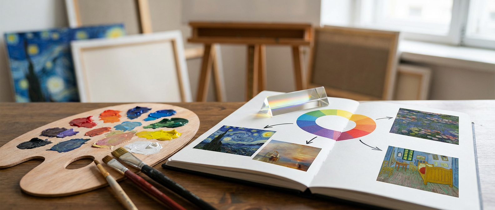
This is when color theory stops being academic and becomes visceral. Van Gogh understood what the Impressionists had started to grasp: color exists in relationship, not isolation. Those famous yellows work because they’re surrounded by deep blues and purples. It’s complementary harmony. The painting vibrates because Van Gogh placed opposites on the color wheel directly next to each other, making both colors appear more intense than they could ever be alone.
The teenager moves closer to the canvas. She’s learning what artists have known for centuries: color is never neutral. It carries emotion. Creates space. Tells stories that words can’t touch.

Rothko’s Red Lessons in Pure Emotion
Three galleries over, Mark Rothko’s massive red paintings show color theory’s psychological power. These aren’t just red rectangles floating on canvas. They’re masterclasses in how warm colors advance and cool colors recede, creating depth without perspective.
Rothko built these reds in layers. Crimson over burgundy over orange undertones that seem to glow from within. He understood that red carries weight differently than blue. Red pushes forward, demands attention, raises pulse rates. Standing close to his paintings, you feel your body respond before your mind catches up. This is color as pure sensation.
He spent years perfecting these color relationships. Testing how different reds behaved against each other. How adding a thin line of orange could make the entire composition breathe differently. Rothko proved that understanding color temperature and saturation can create environments that change how we feel, not just what we see.
Museum visitors often describe feeling overwhelmed by these paintings. That’s intentional. Rothko wanted color to bypass intellectual analysis and hit you directly in the chest. His mastery of warm color saturation makes this emotional impact possible.
Mondrian’s Grid Shows Color as Architecture
Piet Mondrian’s geometric compositions reveal color theory’s structural possibilities. His famous grids of black lines containing blocks of primary red, blue, and yellow aren’t random arrangements. They’re carefully balanced systems where each color carries specific visual weight.
In “Composition with Red, Blue, and Yellow,” Mondrian shows that colors have different densities. Red feels heavier than yellow, so he uses smaller amounts of red to balance larger yellow sections. Blue sits between them, both in temperature and visual mass. This is color theory as architectural engineering.
Mondrian strips away everything decorative to focus on pure color relationships. No gradients. No mixing. No atmospheric effects. Just primary colors in their most essential form, proving that understanding color balance can create dynamic compositions using the simplest possible palette.
Fashion designers and graphic artists still study Mondrian’s color proportions. His grid paintings teach fundamental lessons about how different colors compete for attention and how strategic placement can create visual harmony from bold contrasts.
Monet’s Garden Teaches Light and Color Partnership
Claude Monet’s water lily paintings reveal color theory’s most sophisticated lesson: how light changes everything. Standing before his massive panels at the Musée de l’Orangerie, you watch colors shift as clouds pass overhead through the skylight. Monet painted this interaction between natural light and pigment intentionally.
His garden at Giverny became a living laboratory for color experiments. Monet planted flowers in specific arrangements to study how purple shadows fell across yellow blooms. How green reflections in water affected the apparent color of floating lilies. He understood that local color (what something actually is) rarely matches perceived color (what we see under specific lighting conditions).
The water lily paintings show this principle in action. Monet painted the same pond dozens of times, capturing how morning light made the water appear silver-blue while afternoon sun turned it gold-green. He layered these color observations in loose brushstrokes that seem to flicker like actual light hitting water.
Contemporary artists still reference Monet’s discoveries about color temperature in natural light. His plein air painting method taught generations that color is never static but constantly shifting based on atmospheric conditions.
Your Everyday Color Connections
These painterly lessons appear everywhere once you start looking. The street mural on my corner uses Van Gogh’s complementary strategy, placing orange letters against blue backgrounds to grab attention from passing cars. The café down the street painted their walls in Rothko-inspired warm tones because the owner understands how red undertones make spaces feel intimate.
Interior designers employ Mondrian’s balance principles when they pair one large blue sofa with several smaller red accessories. Photographers chase Monet’s golden hour because they know how warm light transforms ordinary scenes into something magical.
Your grandmother’s quilt probably has sophisticated color theory too. Traditional quilt patterns often use analogous colors (neighbors on the color wheel) to create harmony, with occasional complementary accents for visual interest. Those folk artists understood intuitively what formal color theory later codified.
Next time you’re in a museum, try this: pick one painting and trace how the artist used color to guide your eye around the composition. Notice which areas advance and which recede. Look for color echoes that create visual rhymes across the canvas. You’re not just looking at art anymore. You’re reading the color language that connects medieval stained glass to contemporary street art to your own daily visual choices.