Soft Brutalism and the Ghost of Rothko: Why 2026’s Biggest Design Trend Is Really Abstract Expressionism in Disguise
The Numbers Tell a Story Worth Listening To
Something shifted in how we want our spaces to feel. The Pinterest 2026 Trend Report landed with a quiet revelation: Soft Brutalism had claimed the top spot, with saves climbing 312% higher than the previous year’s leading aesthetic. That’s not just a number. That’s a collective exhale. Millions of people suddenly looking at their walls and saying, “I want something that doesn’t apologize for being complicated.”
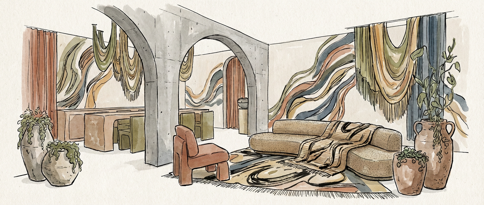
What makes this worth paying attention to: Soft Brutalism isn’t coming from nowhere. It’s not some algorithm-generated aesthetic that bubbled up through Instagram’s recommendation engine. It’s a direct conversation with the abstract expressionists who changed how we see color, form, and emotional space. Artists who understood that a painting could be a room, and a room could be a painting.
Rothko’s Shadow on Our Walls
Mark Rothko understood something that most people don’t: color isn’t decoration. It’s atmosphere. It’s psychology made visible. When he created the Seagram Murals between 1958 and 1959, he wasn’t thinking about interior design trends. He was thinking about transcendence. About how light moving across a field of deep reds and browns could make you feel small and infinite simultaneously. Those paintings live now at the Tate Modern Rothko Room, and they remain one of the most emotionally disorienting experiences you can have in a gallery.
Interior designers in 2026 are returning to this archive deliberately. They’re looking at those murals and asking: what if we could bring that feeling into everyday spaces? What if a living room could carry the emotional weight of a Rothko without needing canvas and paint? Soft Brutalism answers that question by taking the essence of color field painting and translating it into materiality. Textured walls. Raw concrete softened by creams and warm grays. Layers that suggest complexity without demanding explanation.
The connection runs deeper than visual similarity. Rothko spent his career fighting against the idea that abstraction was cold or cerebral. He wanted abstraction to be felt. Contemporary soft brutalist interiors carry that same philosophy. They push back against the sterile minimalism that dominated the previous decade. Roughness is okay. Imperfection is honest. Emotional resonance matters more than polish.
When Pour Paintings Met the Furniture Fair
Helen Frankenthaler developed a technique in the 1950s that changed everything. She poured paint onto unprimed canvas, letting gravity and instinct guide the flow. The results looked like landscape paintings, like weather systems, like the interior of her own mind rendered visible. Each piece was unrepeatable, a conversation between artist and accident.
When the London design firm Ronan & Erwan Bouroullec unveiled their 2025 Milan Furniture Fair installation, they’d studied Frankenthaler’s technique obsessively. They translated her methodology into furniture design: layered materials, unexpected color interactions, surfaces that seemed to have emerged from process rather than calculation. The installation reached 2.8 million Instagram impressions in forty-eight hours. People couldn’t stop looking at it. Because it carried the same quality that Frankenthaler’s paintings carried. It looked alive.
This is the critical piece that separates Soft Brutalism from other design trends. It’s not borrowing the aesthetic vocabulary of abstract expressionism as decoration. It’s borrowing the methodology. The philosophy. The understanding that form emerges through layering, through allowing materials to speak, through treating imperfection as information rather than failure.
Black, White, and the Architecture of Contrast
Franz Kline painted with slash and urgency. His black lines on white grounds felt like calligraphy crossed with explosion. They had architectural weight and emotional velocity. Benjamin Moore, when designing their 2026 Color of the Year, looked at Kline’s high-contrast compositions and saw something relevant to where we are right now.
The color they landed on? Cinder Rose 2108-40. Described as inspired by Kline’s black-and-white abstractions, but it’s neither black nor white. It’s a bridge between extremes. A gray that holds warmth. A neutral that refuses to stay quiet. This is exactly what Soft Brutalism does architecturally. It takes the raw honesty of brutalism, that unforgiving concrete and angular geometry, and softens it through color choices informed by decades of painters studying how hue affects space.
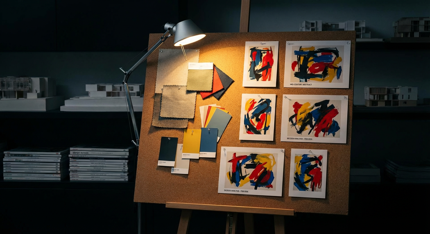
A Dezeen analysis of 150 top interior design projects in February 2026 found that forty-four percent included direct references to mid-century American abstract painting in their mood boards. Forty-four percent. That’s not coincidence. That’s a generation of designers returning to the source code, saying: we need to remember what these artists knew about how humans experience space.
Why This Moment Matters
We tend to think of art history and interior design as separate languages. Galleries in one box, living rooms in another. But 2026 suggests something different. When we’re searching for how to live better, we keep returning to artists who explored consciousness itself.
Soft Brutalism isn’t resonating because it photographs well. It’s resonating because it’s honest about contradiction. Beauty doesn’t require smoothness. Material truth and emotional warmth aren’t opposites. Your home can be a space where you feel both grounded and unsettled, the same way you feel standing in front of a Rothko.
The painters who created the language we’re now speaking through interior design understood that space is psychology. Color is emotion. The way light hits a surface isn’t incidental. It’s everything. Two generations later, we’re finally catching up to what they knew, and in doing so, we’re making our homes into conversations with abstraction itself.
What are you seeing in your own spaces right now? Are you noticing the pull toward rawness, toward color that carries weight, toward materials that refuse to hide? I’d love to know what drew you here and what you’re building or imagining for the rooms around you.